This page was generated from
docs/Examples/Amphibole/Amphibole_Classification_Diagrams.ipynb.
Interactive online version:
![]() .
.
Amphibole Classification Diagrams
This notebook shows how to plot Amphiboles on the Leake Calcic ampibole classification diagram
At present, we have only included the bottom figure from Leake et al. (1997) for the calcic amphiboles
If you really need other diagrams, please reach out to Penny and she can maybe add some of the other ones!
You can download the excel spreadsheet with data here: https://github.com/PennyWieser/Thermobar/blob/main/docs/Examples/Amphibole/Amphibole_Liquids.xlsx
[1]:
# Load in some import Python things, and Thermobar
import numpy as np
import pandas as pd
import matplotlib.pyplot as plt
import Thermobar as pt
pd.options.display.max_columns = None
You need to install Thermobar once on your machine, if you haven’t done this yet, uncomment the line below (remove the #)
[10]:
#!pip install Thermobar
[2]:
# Set some plotting parameters
plt.rcParams["font.family"] = 'arial'
plt.rcParams["font.size"] =12
plt.rcParams["mathtext.default"] = "regular"
plt.rcParams["mathtext.fontset"] = "dejavusans"
plt.rcParams['patch.linewidth'] = 1
plt.rcParams['axes.linewidth'] = 1
plt.rcParams["xtick.direction"] = "in"
plt.rcParams["ytick.direction"] = "in"
plt.rcParams["ytick.direction"] = "in"
plt.rcParams["xtick.major.size"] = 6 # Sets length of ticks
plt.rcParams["ytick.major.size"] = 4 # Sets length of ticks
plt.rcParams["ytick.labelsize"] = 12 # Sets size of numbers on tick marks
plt.rcParams["xtick.labelsize"] = 12 # Sets size of numbers on tick marks
plt.rcParams["axes.titlesize"] = 14 # Overall title
plt.rcParams["axes.labelsize"] = 14 # Axes labels
Import amphiboles and associated liquids
These amphiboles are from 2 units, unit 1 and unit 2
[3]:
out=pt.import_excel('Amphibole_Liquids.xlsx', sheet_name="Amp_only_for_plotting")
my_input=out['my_input']
Amps=out['Amps']
[4]:
## Check everything loaded in right, e.g., check no columns filled with zeros that should have data
display(Amps.head())
| SiO2_Amp | TiO2_Amp | Al2O3_Amp | FeOt_Amp | MnO_Amp | MgO_Amp | CaO_Amp | Na2O_Amp | K2O_Amp | Cr2O3_Amp | F_Amp | Cl_Amp | Sample_ID_Amp | |
|---|---|---|---|---|---|---|---|---|---|---|---|---|---|
| 0 | 42.43 | 2.50 | 12.97 | 7.80 | 0.09 | 15.56 | 11.21 | 2.41 | 1.61 | 0.31 | 0 | 0 | Unit1 |
| 1 | 41.19 | 2.62 | 12.25 | 9.44 | 0.11 | 15.67 | 11.54 | 2.44 | 1.40 | 0.10 | 0 | 0 | Unit1 |
| 2 | 45.69 | 1.44 | 9.64 | 13.37 | 0.21 | 14.57 | 10.72 | 1.76 | 0.23 | 0.00 | 0 | 0 | Unit1 |
| 3 | 45.56 | 1.43 | 10.40 | 12.27 | 0.21 | 15.15 | 11.03 | 1.89 | 0.25 | 0.00 | 0 | 0 | Unit1 |
| 4 | 45.65 | 1.55 | 10.78 | 13.30 | 0.21 | 14.21 | 10.81 | 1.89 | 0.27 | 0.00 | 0 | 0 | Unit1 |
Once we’ve loaded the data in, we can use the loc function to extract separate dataframes for unit 1 and unit2
[5]:
Amps_Unit1=Amps.loc[Amps['Sample_ID_Amp']=="Unit1"]
Amps_Unit2=Amps.loc[Amps['Sample_ID_Amp']=="Unit2"]
This function makes the plot automatically
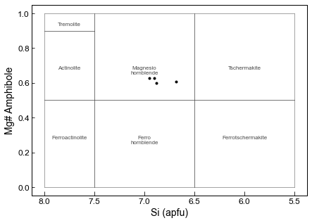
Here, we are plotting the amphiboles on Fig. 3 (bottom) from Leake, which is for Ca_B<1.5, and Na_A + K_A <0.5, CaA < 0.50
The option “site_check=True” means that it only plots amphibles which fit these criteria, and the printed message tells you how many were excluded. If you want to plot ones outside this Ca_B and Na_A and K_A range anyway, select site_check=False.
This is not as customizable as the bottom option, where we show how to construct the plot yourself, but provides a good first look.
[6]:
fig=pt.plot_amp_class_Leake(amp_comps=Amps, fontsize=8, color=[0.3, 0.3, 0.3],
linewidth=0.5, lower_text=0.3, upper_text=0.7, text_labels=True, site_check=True,
plots="Ca_Amphiboles", marker='.k')
0 amphiboles have Ca_B<1.5, so arent shown on this plot
0 amphiboles have Ca_A>=0.5, so arent shown on this plot
17 amphiboles have Na_A+K_A>0.5, so arent shown on this plot
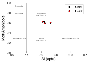
Making a more customizable plot, e.g., plotting different units as different colours
Here, we are plotting the amphiboles on Fig. 3a from Leake, which is for Ca_B<1.5, and Na_A + K_A <0.5
By default, this code will plot all amphiboles, some of which may not actually lie on this diagram.
[9]:
fig, (ax1) = plt.subplots(1, figsize=(5, 3.5), sharey=True)

# First, add the fields to your axis
pt.add_Leake_Amp_Fields_Fig3bot(ax1, fontsize=8, color=[0.3, 0.3, 0.3],
linewidth=0.5, lower_text=0.3, upper_text=0.8, text_labels=True)

# Now calculate the amphibole components
cat_23ox_Unit1=pt.calculate_Leake_Diagram_Class(amp_comps=Amps_Unit1)
cat_23ox_Unit2=pt.calculate_Leake_Diagram_Class(amp_comps=Amps_Unit2)

# You only want the ones where "Diagram" = Fig. 3 - bottom - LHS,
#Lets use Loc to find these rows
cat_23ox_Unit1_Correct=cat_23ox_Unit1.loc[
    cat_23ox_Unit1['Diagram']=="Fig. 3 - bottom - LHS"]
cat_23ox_Unit2_Correct=cat_23ox_Unit2.loc[
    cat_23ox_Unit2['Diagram']=="Fig. 3 - bottom - LHS"]

# Now add these components to the axis, you can change symbol size, plot multiple amphioble populations in different colors.
ax1.plot(cat_23ox_Unit1_Correct['Si_Amp_cat_23ox'],
         cat_23ox_Unit1_Correct['Mgno_Amp'], 'ok', label='Unit1')
ax1.plot(cat_23ox_Unit2_Correct['Si_Amp_cat_23ox'],
         cat_23ox_Unit2_Correct['Mgno_Amp'], 'ok', mfc='red', label='Unit2')

# Now reverse the x axis to match the common way of showing this in the literature
ax1.invert_xaxis()

# Add the axes labels
ax1.set_ylabel('Mg# Amphibole')
ax1.set_xlabel('Si (apfu)')

# Add a legend
ax1.legend(loc='upper right', facecolor='white', framealpha=1)

# Adjust axis - Here, incorperate limit of diagram,
# but could trim to emphasize certain bits of data.
ax1.set_ylim([0, 1])
ax1.set_xlim([8, 5.5])
fig.savefig('Amp_Diagram.png', dpi=300)
[ ]: