This page was generated from
docs/Examples/Other_features/Calibration_Plot_Examples.ipynb.
Interactive online version:
![]() .
.
Assessing Calibration Ranges of models
This notebook shows how users can plot their data amonst the calibration range of different models to assess whether they are within the calibration range
You can download the excel spreadsheet here: https://github.com/PennyWieser/Thermobar/blob/main/docs/Examples/Other_features/Example_Liq_Px_Amp.xlsx
[1]:
#!pip install Thermobar --upgrade
[2]:
# First, load various python things. If you haven't installed Thermobar do so now
# by removing the # next to !pip install

#!pip install Thermobar
import Thermobar as pt
import pandas as pd
import numpy as np
import matplotlib.pyplot as plt
pt.__version__
[2]:
'1.0.40'
Step 1: Load in data from your system
in this case some pyroxene, amphibole and liquid data.
[3]:
out=pt.import_excel('Example_Liq_Px_Amp.xlsx', sheet_name="Liquid")
Liquids1=out['Liqs']

out2=pt.import_excel('Example_Liq_Px_Amp.xlsx', sheet_name="Pyroxene")
Cpxs1=out2['Cpxs']

out3=pt.import_excel('Example_Liq_Px_Amp.xlsx', sheet_name="Amphibole")
Amps1=out3['Amps']
c:\Users\penny\anaconda3\Lib\site-packages\openpyxl\worksheet\_read_only.py:79: UserWarning: Unknown extension is not supported and will be removed
  for idx, row in parser.parse():
Step 2: The two ways to use these functions
You have two options, you can either use the function “return_cali_dataset” which will return the calibration dataset of each model so you can make whatever plots you want.
Or, you can use the prebuilt plotting function “generic_cali_plot” which allows you to specify a model, and an x and y paramter, and will make the plot for you.
You can see the different options using the help function
We will add as many calibratoin datasets as we can find - if you have one, please reach out! So far, the supported ones are listed here under “model” for each phase
[4]:
help(pt.generic_cali_plot)
Help on function generic_cali_plot in module Thermobar.calibration_plots:

generic_cali_plot(df, model=None, x=None, y=None, P_kbar=None, T_K=None, figsize=(7, 5), shape_cali='o', mfc_cali='white', mec_cali='k', ms_cali=5, shape_data='^', mfc_data='red', alpha_cali=1, alpha_data=1, mec_data='k', ms_data=10, order='cali bottom', save_fig=False, fig_name=None, dpi=200)
    This function plots your compositions amongst the calibration dataset for a variety of models where we could
    obtain the exact calibration dataset. see model for option.

    Parameters
    -------

    df: pandas DataFrame
        dataframe of your compositions, e.g. a dataframe of Cpx composition

    x and y: str
        What you want to plotted against each other. E.g. x="SiO2_Cpx", y="Al2O3_Cpx"

    model: str
        AMPHIBOLE:
        Ridolfi2021:  Ridolfi et al. (2012)
        Putirka2016:  Putirka (2016)
        Mutch2016: Mutch et al. (2016)
        Zhang2017: Zhang et al. (2017)


        CPX:
        Putirka2008: Putirka (2008) - entire database for Cpx-Liq,
        (not used for all equations).
        Masotta2013: Masotta et al. (2013)
        Neave2017:  Neave and Putirka (2017) for Cpx-Liq
        Brugman2019: Brugman and Till 2019
        Petrelli2020:  Petrelli et al. (2020) for Cpx and Cpx-Liq
        Wang2021: Wang et al. (2021) Cpx-only,but contains Liq compositions too.
        Jorgenson2022: Jorgenson et al. (2022) Cpx-Liq and Cpx-only,

        PLAGIOCLASE
        Waters2015: Waters and Lange (2015) for plag-liq hygrometry
        Masotta2019: Masotta et al. (2019) plag-liq hygrometry

        LIQUID
        Shea2022: Shea et al. (2022) for Ol MgO thermometry and Kd values


    P_kbar and T_K: pd.Series
        if you want to plot calculated pressure and temperature against the calibration range,
        specify those panda series here, and it will append them onto your dataframe

    Plot customization options.
    -------


    figsize: (x, y)
        figure size

    order: 'cali top' or 'cali bottom':
        whether cali or user data is plotted ontop. default, cali data bottom

    shape_cali, shape_data:
        matplotlib symbol, e.g. shape_cali='o' and shape_data='^' are the defaults

    ms_cali, ms_data:
        marker size for cali and user data

    mfc_cali, mfc_data:
        marker face color for cali and data (can be different)

    mec_cali, mfc_data:
        marker edge color for cali and data.

    alpha_cali, alpha_data:
        transparency of symbols

    save_fig: bool
        if True, saves figure
        Uses fig_name to give filename,  dpi to give dpi
Example 1 - Amphibole
Example 1a- First, lets use the prebuilt plot functions
[6]:
## Example in manuscript - v simple
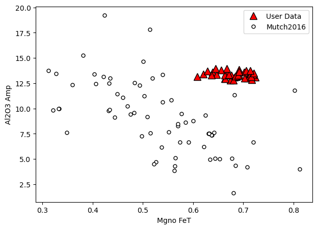
a=pt.generic_cali_plot(df=Amps1, model="Mutch2016",
x='Mgno_FeT', y='Al2O3_Amp')
a.savefig('Cali_plot_amphibole.png', dpi=200)
Resolved CSV file path: c:\users\penny\box\postdoc\mybarometers\thermobar_outer\src\Thermobar\Mutch_Cali_input.csv
[7]:
# Here we specify we want mutch, that we want calibration data
# on the bottom, and alpha (Transparency) at 80% for our data
a=pt.generic_cali_plot(df=Amps1, model="Mutch2016",
        x='Mgno_FeT', y='Al2O3_Amp',  order="cali bottom",
                       alpha_cali=1, alpha_data=0.8)
Resolved CSV file path: c:\users\penny\box\postdoc\mybarometers\thermobar_outer\src\Thermobar\Mutch_Cali_input.csv

Here we specify we want mutch, that we want calibration data on the bottom, and alpha (Transparency) at 80% for our data
[8]:
a=pt.generic_cali_plot(df=Amps1, model="Ridolfi2021",
        x='Mgno_FeT', y='Al2O3_Amp',  order="cali bottom",
                       alpha_cali=1, alpha_data=0.8)
Resolved CSV file path: c:\users\penny\box\postdoc\mybarometers\thermobar_outer\src\Thermobar\Ridolfi_Cali_input.csv

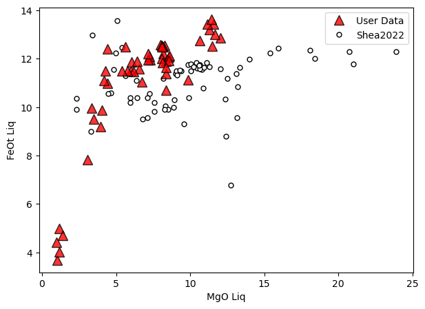
Perhaps we want to compare the liquids to a KD model
[30]:
a=pt.generic_cali_plot(df=Liquids1, model="Shea2022",
        x='MgO_Liq', y='FeOt_Liq',  order="cali bottom",
                       alpha_cali=1, alpha_data=0.8)
Resolved CSV file path: c:\users\penny\box\postdoc\mybarometers\thermobar_outer\src\Thermobar\Shea2022_Cali_input.csv
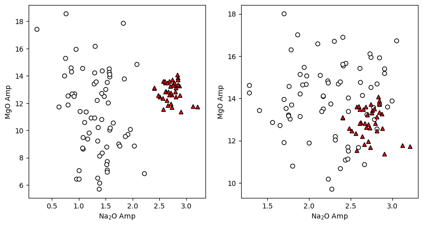
Example 1b: lets load the calibration datasets for Mutch and Ridolfi
[9]:
Cali_Dataset_Mutch=pt.return_cali_dataset(model="Mutch2016")
Cali_Dataset_Ridolfi=pt.return_cali_dataset(model="Ridolfi2021")
Resolved CSV file path: c:\users\penny\box\postdoc\mybarometers\thermobar_outer\src\Thermobar\Mutch_Cali_input.csv
Resolved CSV file path: c:\users\penny\box\postdoc\mybarometers\thermobar_outer\src\Thermobar\Ridolfi_Cali_input.csv
Now we can use matplotlib to make whatever plot we want
[10]:
fig, (ax1, ax2) = plt.subplots(1, 2, figsize=(10,5))
ax1.plot(Cali_Dataset_Mutch['Na2O_Amp'], Cali_Dataset_Mutch['MgO_Amp'],
         'ok', mfc='white')
ax1.plot(Amps1['Na2O_Amp'], Amps1['MgO_Amp'], '^k', mfc='red')
ax1.set_xlabel('Na$_2$O Amp')
ax1.set_ylabel('MgO Amp')


ax2.plot(Cali_Dataset_Ridolfi['Na2O_Amp'], Cali_Dataset_Ridolfi['MgO_Amp'],
         'ok', mfc='white')
ax2.plot(Amps1['Na2O_Amp'], Amps1['MgO_Amp'], '^k', mfc='red')
ax2.set_xlabel('Na$_2$O Amp')
ax2.set_ylabel('MgO Amp')
[10]:
Text(0, 0.5, 'MgO Amp')
Example 1c - What if we want to compare pressures and temperatures to the cali dataset?
First, we need to calculate the P and Ts using the equations.
[11]:
P_Mutch=pt.calculate_amp_only_press(amp_comps=Amps1, equationP="P_Mutch2016")
P_Ridolfi=pt.calculate_amp_only_press_temp(amp_comps=Amps1,
                                           equationP="P_Ridolfi2021",
                                          equationT="T_Ridolfi2012")
[12]:
P_Ridolfi.head()
[12]:
| P_kbar_calc | T_K_calc | Input_Check | Fail Msg | classification | equation | SiO2_Amp | TiO2_Amp | Al2O3_Amp | FeOt_Amp | MnO_Amp | MgO_Amp | CaO_Amp | Na2O_Amp | K2O_Amp | Cr2O3_Amp | F_Amp | Cl_Amp | Sample_ID_Amp | |
|---|---|---|---|---|---|---|---|---|---|---|---|---|---|---|---|---|---|---|---|
| 0 | 4.922720 | 1301.307668 | True | kaersutite | (1b+1c)/2 | 40.46 | 5.96 | 12.97 | 11.18 | 0.1201 | 12.35 | 11.54 | 2.56 | 1.1721 | 0.0093 | 0.0 | 0.0 | Lava_1_amph-2_ | |
| 1 | 5.751972 | 1337.114450 | True | kaersutite | 1a | 40.85 | 6.14 | 13.08 | 10.70 | 0.2122 | 12.88 | 11.35 | 2.62 | 0.8556 | 0.0069 | 0.0 | 0.0 | Lava_1-8_ | |
| 2 | 9.288183 | 1344.043447 | True | kaersutite | 1e | 40.76 | 5.54 | 13.13 | 13.08 | 0.1802 | 11.38 | 11.38 | 2.90 | 0.8943 | 0.0022 | 0.0 | 0.0 | Lava_1-16_ | |
| 3 | 7.976460 | 1335.292103 | True | kaersutite | 1d | 40.62 | 5.60 | 13.42 | 11.16 | 0.1066 | 12.61 | 11.57 | 2.73 | 0.9961 | 0.0000 | 0.0 | 0.0 | Lava_1-20_ | |
| 4 | 8.048350 | 1333.351123 | True | kaersutite | 1d | 39.99 | 5.49 | 13.60 | 12.03 | 0.1600 | 11.96 | 11.56 | 2.71 | 1.0031 | 0.0092 | 0.0 | 0.0 | Lava_1-24_ |
Now we can use the generic plot function to add the P_kbar onto the dataframe
[13]:
a=pt.generic_cali_plot(df=Amps1, model="Ridolfi2021",
        x='P_kbar', y='Mgno_FeT', P_kbar=P_Ridolfi['P_kbar_calc'],
                       order="cali bottom",
                       alpha_cali=1, alpha_data=0.8)
Resolved CSV file path: c:\users\penny\box\postdoc\mybarometers\thermobar_outer\src\Thermobar\Ridolfi_Cali_input.csv

Or, for Ridolfi, plot pressure and temperature
[14]:
a=pt.generic_cali_plot(df=Amps1, model="Ridolfi2021",
        x='P_kbar', y='T_K', P_kbar=P_Ridolfi['P_kbar_calc'],
                       T_K=P_Ridolfi['T_K_calc'],
                       order="cali bottom",
                       alpha_cali=1, alpha_data=0.4)
Resolved CSV file path: c:\users\penny\box\postdoc\mybarometers\thermobar_outer\src\Thermobar\Ridolfi_Cali_input.csv

[15]:
a=pt.generic_cali_plot(df=Amps1, model="Mutch2016",
        x='P_kbar', y='Mgno_FeT', P_kbar=P_Mutch['P_kbar_calc'],
                       order="cali bottom",
                       alpha_cali=1, alpha_data=0.8)
Resolved CSV file path: c:\users\penny\box\postdoc\mybarometers\thermobar_outer\src\Thermobar\Mutch_Cali_input.csv

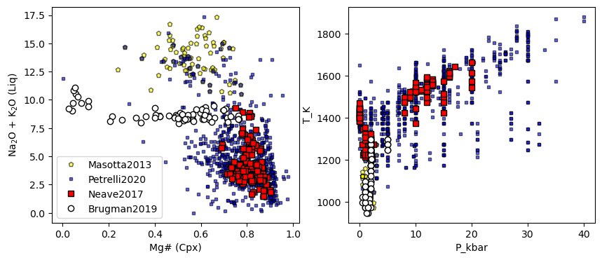
Example 2 - Cpx
Example 2a: Loading the various calibration datasets, making plots using mpl
[16]:
Rid_Cali=pt.return_cali_dataset(model='Ridolfi2021')
Rid_Cali.head()
Resolved CSV file path: c:\users\penny\box\postdoc\mybarometers\thermobar_outer\src\Thermobar\Ridolfi_Cali_input.csv
[16]:
| Unnamed: 0 | Reference | spot/exp. | T | P | H2O_Liq | ∆NNO | logfO2 | Unnamed: 7 | SiO2_Amp | ... | Total | Fail Msg | Input_Check | Mgno_Fe2 | Mgno_FeT | Na_calc | B_Sum | A_Sum | class | classification | |
|---|---|---|---|---|---|---|---|---|---|---|---|---|---|---|---|---|---|---|---|---|---|
| 0 | 0 | Adam & Green (1994) | 1446 | 1050 | 1500.0 | NaN | NaN | NaN | NaN | 42.43 | ... | NaN | NaN | True | 0.868273 | 0.780512 | 0.258108 | 2.0 | 0.717443 | NaN | Mg-hastingsite |
| 1 | 1 | Adam & Green (1994) | 1447 | 1050 | 1000.0 | NaN | NaN | NaN | NaN | 41.19 | ... | NaN | NaN | True | 0.885676 | 0.747414 | 0.194505 | 2.0 | 0.757125 | NaN | Mg-hastingsite |
| 2 | 2 | Gardner et al. (1995) | G-14b | 850 | 250.0 | 6.3 | 1.191313 | -11.594939 | NaN | 45.69 | ... | NaN | NaN | True | 0.899146 | 0.660164 | 0.363048 | 2.0 | 0.165110 | NaN | Mg-Hornblende |
| 3 | 3 | Gardner et al. (1995) | G-15a | 850 | 250.0 | 5.7 | 1.190000 | -11.596251 | NaN | 45.56 | ... | NaN | NaN | True | 0.918743 | 0.687599 | 0.328591 | 2.0 | 0.234784 | NaN | Tschermakitic pargasite |
| 4 | 4 | Gardner et al. (1995) | G-14a | 850 | 250.0 | 7.0 | 0.986417 | -11.799834 | NaN | 45.65 | ... | NaN | NaN | True | 0.872857 | 0.655715 | 0.363498 | 2.0 | 0.202943 | NaN | Tschermakitic pargasite |
5 rows × 82 columns
[17]:
Brugman_Cali=pt.return_cali_dataset(model='Brugman2019')
Petrelli_Cali=pt.return_cali_dataset(model='Petrelli2020')
Neave_Cali=pt.return_cali_dataset(model='Neave2017')
Masotta_Cali=pt.return_cali_dataset(model='Masotta2013')
# And calculate Cpx components for loaded cpx
input_cpx_comps=pt.calculate_clinopyroxene_components(cpx_comps=Cpxs1)
Resolved CSV file path: c:\users\penny\box\postdoc\mybarometers\thermobar_outer\src\Thermobar\Brugman_2019_Cali_input.csv
Resolved CSV file path: c:\users\penny\box\postdoc\mybarometers\thermobar_outer\src\Thermobar\Petrelli20_Cali_input.csv
Resolved CSV file path: c:\users\penny\box\postdoc\mybarometers\thermobar_outer\src\Thermobar\NeavePutirka_2017_Cali_input.csv
Resolved CSV file path: c:\users\penny\box\postdoc\mybarometers\thermobar_outer\src\Thermobar\Masotta_2013_Cali_input.csv
[18]:
## Lets have a look at these
fig, (ax1, ax2) = plt.subplots(1, 2, figsize=(10,4))
ax1.plot(Masotta_Cali['Mgno_Cpx'],
         Masotta_Cali['Na2O_Liq']+Masotta_Cali['K2O_Liq'],
         'pk', mfc='yellow', ms=5, alpha=0.6, label='Masotta2013')

ax1.plot(Petrelli_Cali['Mgno_Cpx'],
         Petrelli_Cali['Na2O_Liq']+Petrelli_Cali['K2O_Liq'],
         'sk', mfc='blue', ms=3, alpha=0.6, label='Petrelli2020')

ax1.plot(Neave_Cali['Mgno_Cpx'],
         Neave_Cali['Na2O_Liq']+Neave_Cali['K2O_Liq'],
         'sk', mfc='red', label='Neave2017')

ax1.plot(Brugman_Cali['Mgno_Cpx'],
         Brugman_Cali['Na2O_Liq']+Brugman_Cali['K2O_Liq'],
         'ok', mfc='white', label='Brugman2019')
# Then calc
ax1.legend()
ax1.set_xlabel('Mg# (Cpx)')
ax1.set_ylabel('Na$_2$O + K$_2$O (Liq)')

y2='T_K'
x2='P_kbar'

ax2.plot(Masotta_Cali[x2],
         Masotta_Cali[y2],
         'pk', mfc='yellow', ms=5, alpha=0.6, label='Masotta2013')

ax2.plot(Petrelli_Cali[x2],
         Petrelli_Cali[y2],
         'sk', mfc='blue', ms=3, alpha=0.6, label='Petrelli2020')

ax2.plot(Neave_Cali[x2],
         Neave_Cali[y2],
         'sk', mfc='red', label='Neave2017')

ax2.plot(Brugman_Cali[x2],
         Brugman_Cali[y2],
         'ok', mfc='white', label='Brugman2019')

ax2.set_xlabel(x2)
ax2.set_ylabel(y2)
[18]:
Text(0, 0.5, 'T_K')
Example 2b: Using built in functions for plotting
[19]:
a=pt.generic_cali_plot(df=Cpxs1, model="Neave2017",
        x='Mgno_Cpx', y='Na2O_Cpx',
                       order="cali bottom",
                       alpha_cali=1, alpha_data=0.2)
Resolved CSV file path: c:\users\penny\box\postdoc\mybarometers\thermobar_outer\src\Thermobar\NeavePutirka_2017_Cali_input.csv

Lets say calculate P and T, then make plots with that
[20]:
PT_Pet20=pt.calculate_cpx_only_press_temp(cpx_comps=Cpxs1, equationP="P_Petrelli2020_Cpx_only",
                                            equationT="T_Petrelli2020_Cpx_only")
Youve selected a P-independent function
Youve selected a T-independent function
[21]:
a=pt.generic_cali_plot(df=Cpxs1, model="Petrelli2020",
        x='P_kbar', y='T_K', P_kbar=PT_Pet20['P_kbar_calc'],
                       T_K=PT_Pet20['T_K_calc'],
                       order="cali bottom",
                       alpha_cali=1, alpha_data=0.2)
Resolved CSV file path: c:\users\penny\box\postdoc\mybarometers\thermobar_outer\src\Thermobar\Petrelli20_Cali_input.csv

Example 3 - Assessing matched liquid - Cpx pairs
[22]:
# First, lets calculate matched Cpx-Liq pairs.
cpx_liq_out=pt.calculate_cpx_liq_press_temp_matching(cpx_comps=Cpxs1, liq_comps=Liquids1,
                                                     equationT="T_Mas2013_Talk2012",
                                                     equationP="P_Mas2013_Palk2012")
all_matches=cpx_liq_out['All_PTs']
av_matches=cpx_liq_out['Av_PTs']
Considering N=574 Cpx & N=51 Liqs, which is a total of N=29274 Liq-Cpx pairs, be patient if this is >>1 million!
Youve selected a P-independent function
Youve selected a P-independent function
2207 Matches remaining after initial Kd filter. Now moving onto iterative calculations
Youve selected a P-independent function
Youve selected a T-independent function
Youve selected a T-independent function
Finished calculating Ps and Ts, now just averaging the results. Almost there!
Done!!! I found a total of N=1244 Cpx-Liq matches using the specified filter. N=358 Cpx out of the N=574 Cpx that you input matched to 1 or more liquids
[23]:
## Lets have a look at these
fig, (ax1, ax2) = plt.subplots(1, 2, figsize=(10,4))
ax1.plot(Masotta_Cali['Mgno_Cpx'],
         Masotta_Cali['Na2O_Liq']+Masotta_Cali['K2O_Liq'],
         'pk', mfc='yellow', ms=5, alpha=0.6, label='Masotta2013')

ax1.plot(Petrelli_Cali['Mgno_Cpx'],
         Petrelli_Cali['Na2O_Liq']+Petrelli_Cali['K2O_Liq'],
         'sk', mfc='blue', ms=3, alpha=0.6, label='Petrelli2020')

ax1.plot(Neave_Cali['Mgno_Cpx'],
         Neave_Cali['Na2O_Liq']+Neave_Cali['K2O_Liq'],
         'sk', mfc='red', label='Neave2017', alpha=0.6)

ax1.plot(Brugman_Cali['Mgno_Cpx'],
         Brugman_Cali['Na2O_Liq']+Brugman_Cali['K2O_Liq'],
         'ok', mfc='white', label='Brugman2019', alpha=0.6)

ax1.plot(all_matches['Mgno_Cpx'],  all_matches['Na2O_Liq']+all_matches['K2O_Liq'],
         '*c', ms=10, mfc='None', label='Data', alpha=1)
# Then calc
ax1.legend()
ax1.set_xlabel('Mg# (Cpx)')
ax1.set_ylabel('Na$_2$O + K$_2$O (Liq)')

y2='T_K'
x2='P_kbar'

ax2.plot(Masotta_Cali[x2],
         Masotta_Cali[y2],
         'pk', mfc='yellow', ms=5,  label='Masotta2013', alpha=0.6)

ax2.plot(Petrelli_Cali[x2],
         Petrelli_Cali[y2],
         'sk', mfc='blue', ms=3, label='Petrelli2020', alpha=0.6)

ax2.plot(Neave_Cali[x2],
         Neave_Cali[y2],
         'sk', mfc='red', label='Neave2017', alpha=0.6)

ax2.plot(Brugman_Cali[x2],
         Brugman_Cali[y2],
         'ok', mfc='white', label='Brugman2019', alpha=0.6)

ax2.plot( all_matches['P_kbar_calc'],all_matches['T_K_calc'],
         '*c', ms=10, mfc='None', label='Data', alpha=1)

ax2.set_xlabel(x2)
ax2.set_ylabel(y2)
[23]:
Text(0, 0.5, 'T_K')

[24]:
a=pt.generic_cali_plot(df=all_matches, model="Petrelli2020",
        x='Mgno_Cpx', y='T_K', P_kbar=all_matches['P_kbar_calc'],
                       T_K=all_matches['T_K_calc'],
                       order="cali bottom",
                       alpha_cali=1, alpha_data=0.2)
Resolved CSV file path: c:\users\penny\box\postdoc\mybarometers\thermobar_outer\src\Thermobar\Petrelli20_Cali_input.csv

[25]:
a=pt.generic_cali_plot(df=all_matches, model="Masotta2013",
        x='Mgno_Cpx', y='T_K',
        T_K=all_matches['T_K_calc'],
        order="cali bottom",
        alpha_cali=1, alpha_data=0.2)
Resolved CSV file path: c:\users\penny\box\postdoc\mybarometers\thermobar_outer\src\Thermobar\Masotta_2013_Cali_input.csv

[ ]:
[ ]:
[ ]: