This page was generated from
docs/Examples/Feldspar_Thermobarometry/Fspar_Ternary_Plot.ipynb.
Interactive online version:
![]() .
.
Feldspar ternary classification diagram
Functions written by Jordan Lubbers, adaptations+ merging into Thermobar by Penny Wieser
The function uses fields for fspar ternary from Deer, Howie, and Zussman (1963).
This function relies heavily on the ternary plot package from Marc Harper et al. 2015 - https://github.com/marcharper/python-ternary, if you use these figures, you must cite that (Marc Harper et al. (2015). python-ternary: Ternary Plots in Python. Zenodo. 10.5281/zenodo.594435) as well as Thermobar.
You may have problems with this package if you have the separate “ternary” package installed (yes, there are python packages called ternary and python-ternary- Yay!). I (penny) got the error “module ternary has no attribute figure, so had to uninstall the ternary I had through pip (pip uninstall ternary), and re-install python-ternary through conda in the command line “conda install python-ternary”. If you have everything in pip, or conda, keep in 1 environment, don’t follow my bad example here!
You can download the excel file you need here: https://github.com/PennyWieser/Thermobar/blob/main/docs/Examples/Feldspar_Thermobarometry/Two_Feldspar_input.xlsx
[3]:
import ternary
#  We tested using ternary V.1.0.8
print(ternary.__version__)
1.0.8
[4]:
import matplotlib.pyplot as plt
import numpy as np
import pandas as pd
import Thermobar as pt
from scipy import interpolate
Load in data, in this case, have paired Plag and Kspar data, but could have as seperate sheets
[5]:
out=pt.import_excel('Two_Feldspar_input.xlsx', sheet_name="Paired_Plag_Kspar")
# This extracts a dataframe of all inputs
my_input=out['my_input']
# This extracts a dataframe of kspar compositions from the dictionary "out"
Kspars=out['Kspars']
# This extracts a dataframe of plag compositions from the dictionary "out"
Plags=out['Plags']
Calculate compostions for each in terms of co-ordinates for ternary axis
[6]:
Kspar_tern_points = pt.tern_points_fspar(fspar_comps=Kspars)
Plag_tern_points = pt.tern_points_fspar(fspar_comps=Plags)
Example 1 - Just the classification diagram (be patient, we will add your data in example 2)!
There are a number of options in the function, or you can roll with the defaults
Choose your fig size (default, 6,6)
Whether you want your major and minor grid (default False)
Whether you want the labels (saying San, Ab, Ol, default False)
What you want these labels to read, by default, we have used these: Anorthite_label=’An’, Anorthoclase_label=’AnC’, Albite_label=’Ab’, Oligoclase_label=’Ol’, Andesine_label=’Ad’, Labradorite_label=’La’, Bytownite_label=’By’, Sanidine_label=’San’, But you can change any of these using Sanidine_label=’Sanidine’
The font size ofthe component labels (default 10), e.g., if you go for full words, you might need to reduce the font size, e.g., fontsize_component_labels=6.
The font size of the axes labels (default 14).
major_grid_kwargs, this sets the colors, by default, its grey.
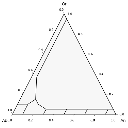
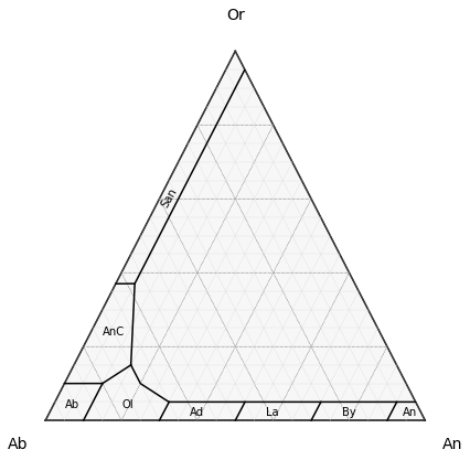
Example 1a - Using all the defaults
This gives you the simplicest diagram possible, e.g., just the lines.
[7]:
fig, tax = pt.plot_fspar_classification()
fig.tight_layout()
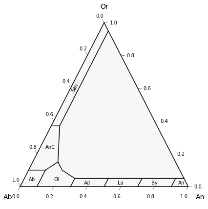
Example 1b - Lets add the default compositional labels
[8]:
fig, tax = pt.plot_fspar_classification(labels=True)
fig.tight_layout()
Example 1c - Lets change it, so it reads “Sanidine” instead of San
[9]:
fig, tax = pt.plot_fspar_classification(labels=True,
                                    Sanidine_label='Sanidine')
fig.tight_layout()

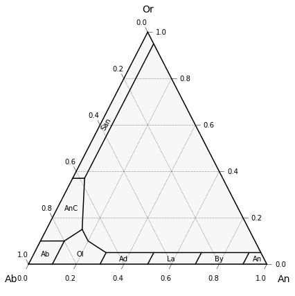
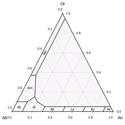
Example 1d - Lets add grid lines
Default for major grid lines is linestyle (ls) is dashed, line width (lw) = 0.5, color (“c”) is black (“k”)
[10]:
fig, tax = pt.plot_fspar_classification(labels=True,  major_grid=True)
fig.tight_layout()
Example 1e - But say we want pink grid lines!
[11]:
fig, tax = pt.plot_fspar_classification(labels=True,  major_grid=True, major_grid_kwargs={"ls": ":", "lw": 0.5, "c": "magenta"})
fig.tight_layout()
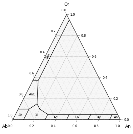
Example 1f - Minor and major gridlines
[12]:
fig, tax = pt.plot_fspar_classification(labels=True,  major_grid=True, minor_grid=True)
fig.tight_layout()
Example 1g - Say we dont want ticks
[13]:
fig, tax = pt.plot_fspar_classification(labels=True,  major_grid=True, minor_grid=True, ticks=False)
fig.tight_layout()
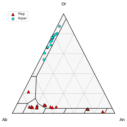
Example 2 - plotting data on top of classification
…and some random customizations to show flexibility
Example 2a - Simple plot coloring symbols by type
We use the Thermobar function “tern points” to convert your calculated plag and kspar data into the necessary coordinates for the ternary plot, you’ll need to do this for as many datasets as you want to plot
[15]:
# Calling tern_points function for plag and kspar data


# make the figure with the classification lines as in the examples above.

fig, tax = pt.plot_fspar_classification(major_grid=True, ticks=False)

# Here we plot the data ontop, with plag as red triangles
tax.scatter(
    Plag_tern_points,
    edgecolor="k",
    marker="^",
    facecolor="red",
    label='Plag',
   s=90
)
# And Kspars as blue dots

tax.scatter(
    Kspar_tern_points,
    edgecolor="k",
    marker="o",
    facecolor="cyan",
   s=60, label='Kspar'
)
tax.legend(loc='upper left')
fig.tight_layout()
fig.savefig('Simple_Plag_fspar.png', dpi=200)
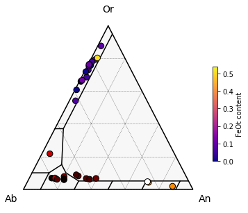
Example 2b - Coloring symbols by a fspar FeOt content
Need to make the plot a bit wier (8) to account for the color legend
[16]:
# make the figure with the classification lines as in the examples above.

fig, tax = pt.plot_fspar_classification(figsize=(6, 5), major_grid=True, ticks=False, )

# Here, we color based on the Cation proportion of FeOt in plag.
# Vmin and vmax just resets the colorbar (by default it does weird things)
# Here, we use the same colorbar for both plots.
tax.scatter(
    Plag_tern_points,
    c=Plags["FeOt_Plag"],
    vmin=np.min([Plags["FeOt_Plag"], Kspars["FeOt_Kspar"]]),
    vmax=np.max([Plags["FeOt_Plag"], Kspars["FeOt_Kspar"]]),
    s=70,
    edgecolor="k",
    cmap="hot",
    colormap="hot",

)

tax.scatter(
    Kspar_tern_points,
    c=Kspars["FeOt_Kspar"],
    vmin=np.min([Plags["FeOt_Plag"], Kspars["FeOt_Kspar"]]),
    vmax=np.max([Plags["FeOt_Plag"], Kspars["FeOt_Kspar"]]),
    edgecolor="k",
    s=70,
    cmap="plasma",
    colormap="plasma",
        colorbar=True,
    cb_kwargs={"shrink": 0.5, "label": "FeOt content"},
)
fig.savefig('Fspar_colored_by_FeOt.png', dpi=200)
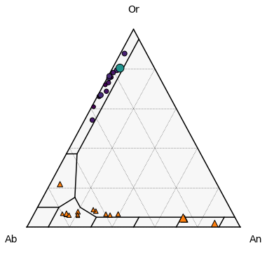
Example 3 - Setting symbol size by FeOt content
[17]:
# make the figure with the classification lines as in the examples above.

fig, tax = pt.plot_fspar_classification(figsize=(6, 6), major_grid=True, ticks=False)

# Here, we color based on the Cation proportion of FeOt in plag.
# Vmin and vmax just resets the colorbar (by default it does weird things)
# Here, we use the same colorbar for both plots.
tax.scatter(
    Plag_tern_points,
    s=200*Plags["FeOt_Plag"]+30,
    edgecolor="k",
    marker="^"

)

tax.scatter(
    Kspar_tern_points,
    c=Kspars["FeOt_Kspar"],
 s=200*Kspars["FeOt_Kspar"]+30,
           edgecolor="k",
    marker="o"
)
[17]:
<AxesSubplot:>